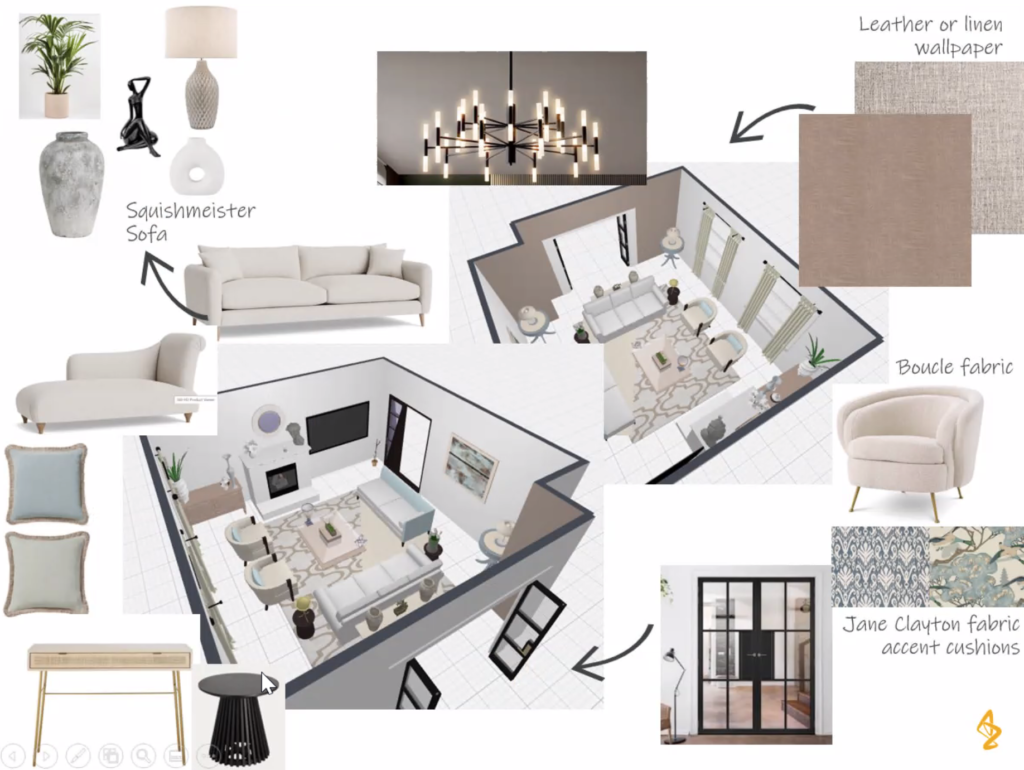
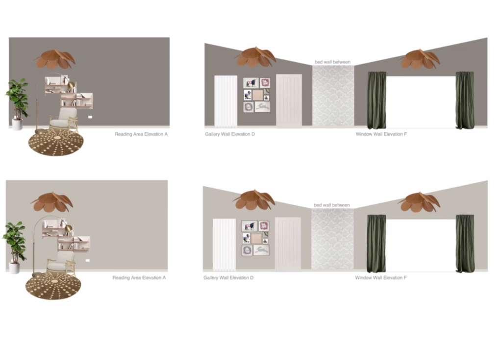
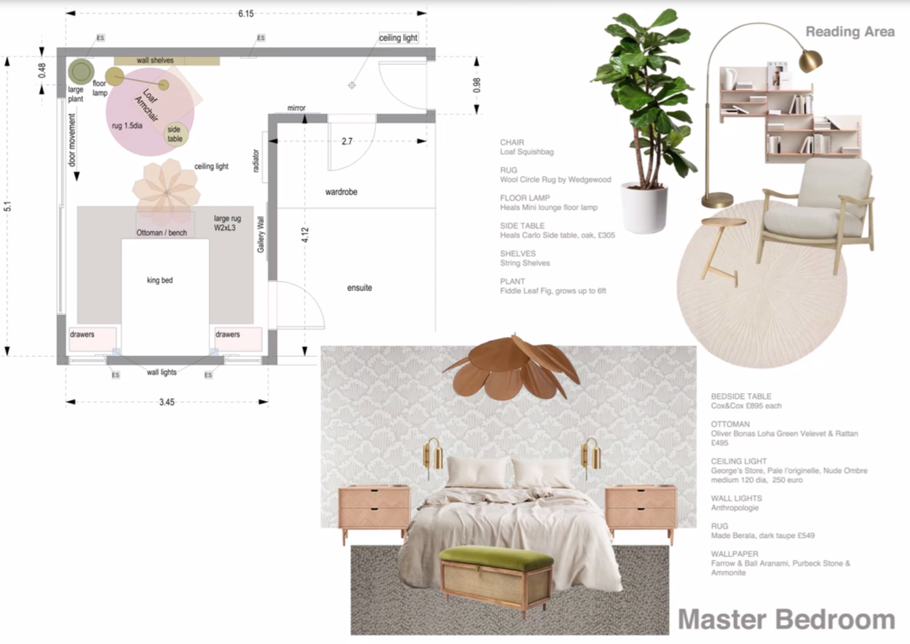
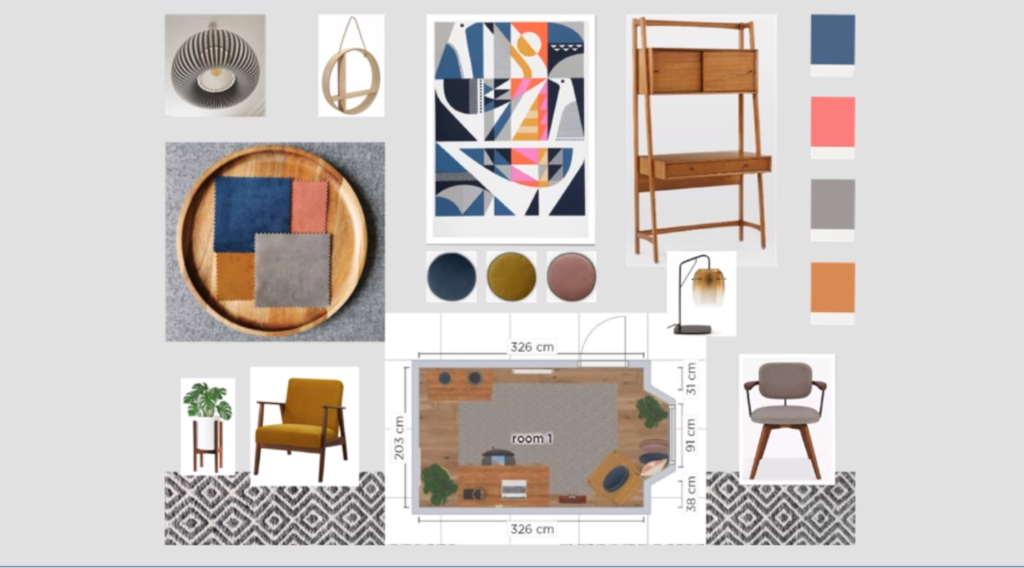
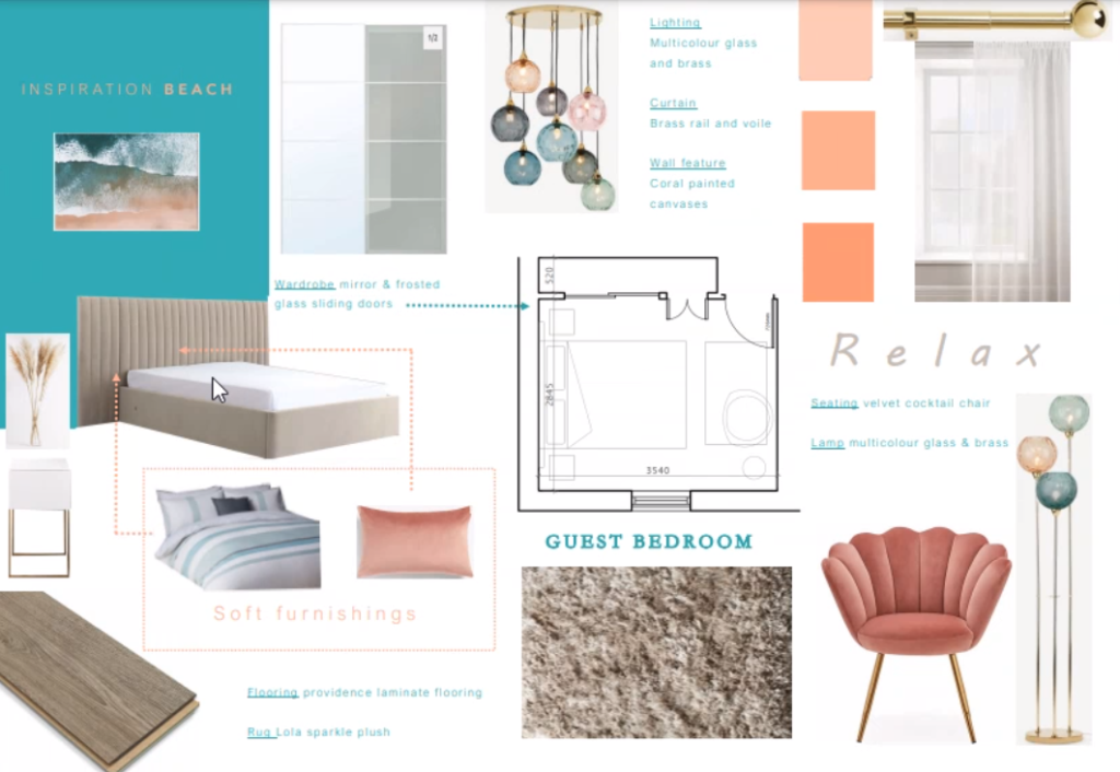
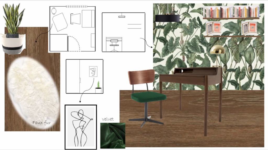
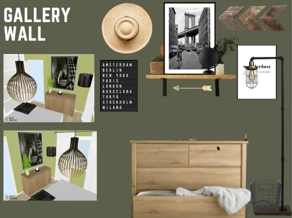
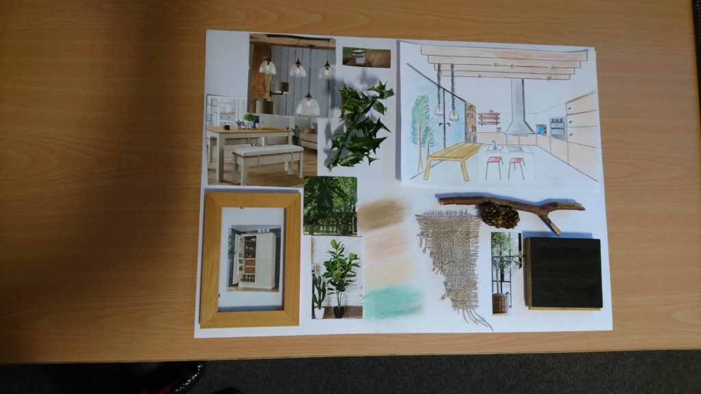
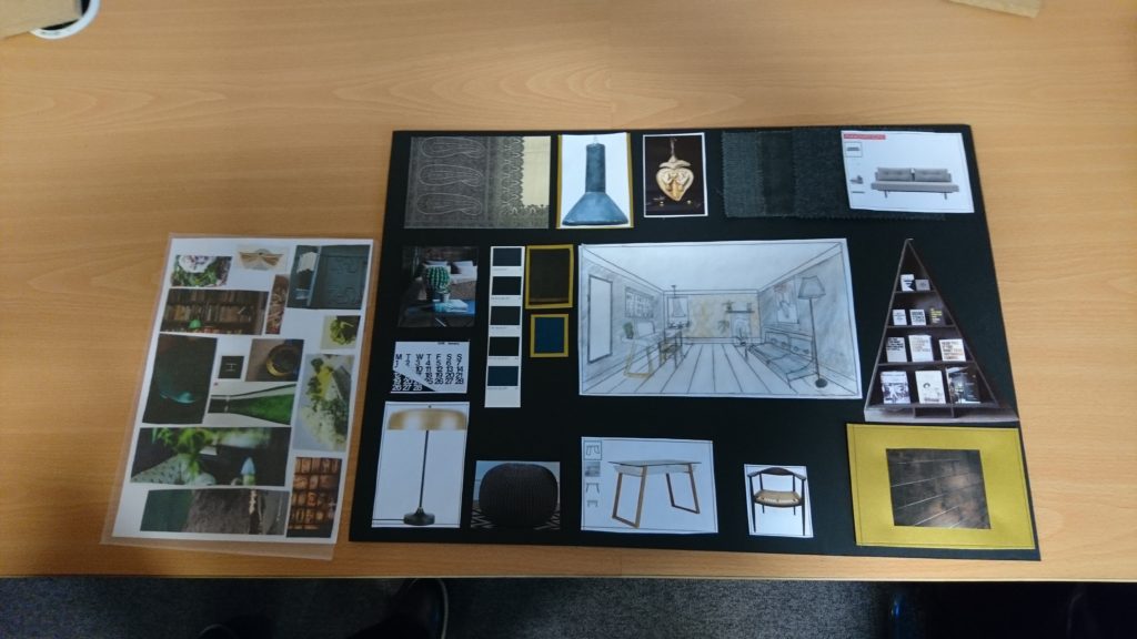
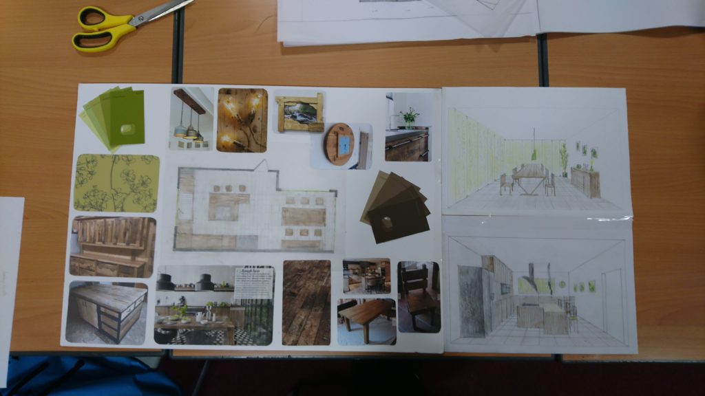
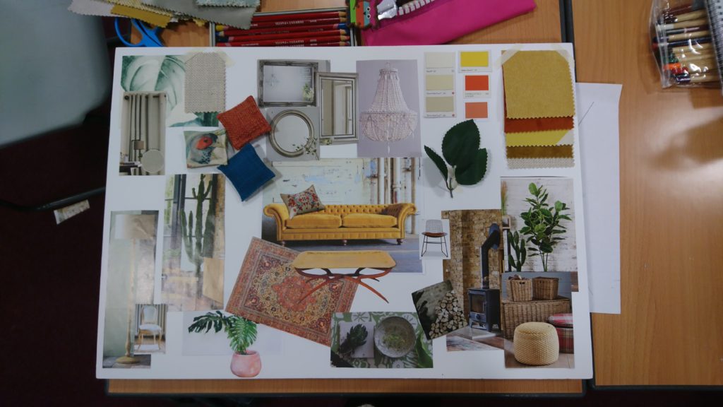
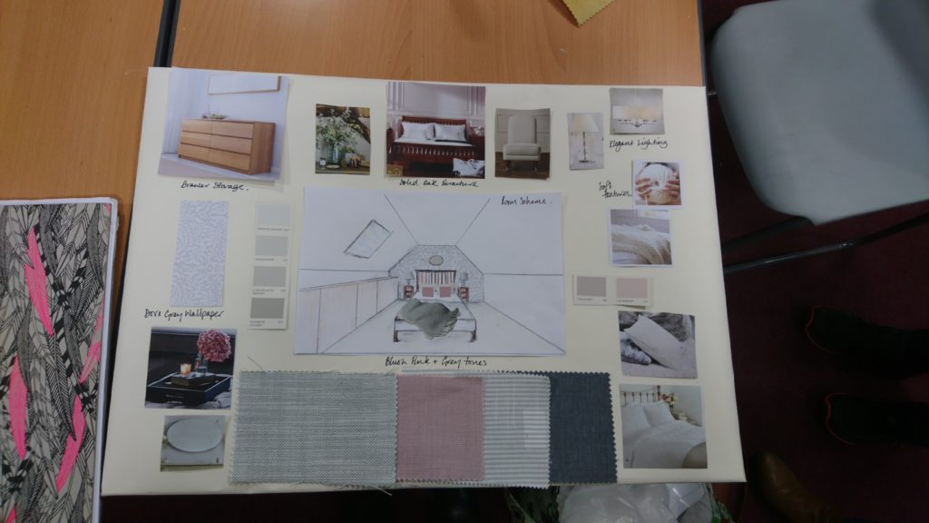
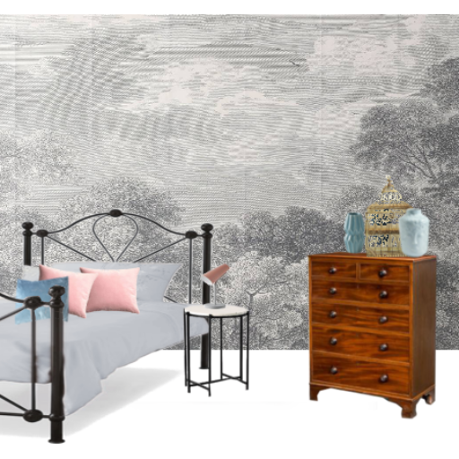
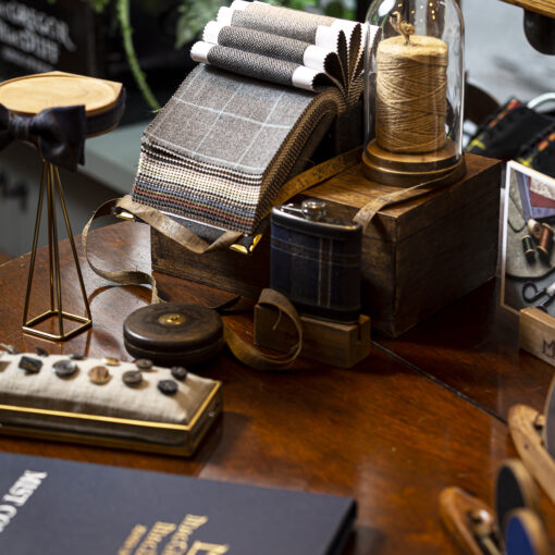
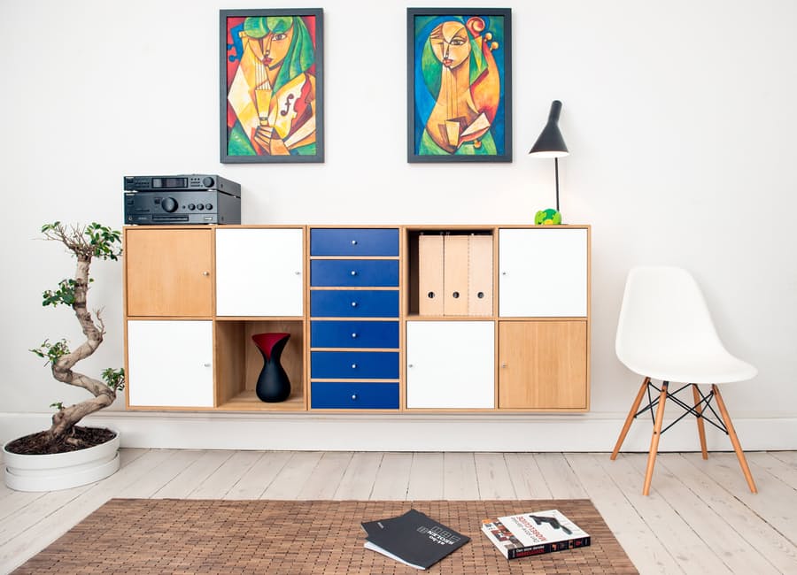
I admit it is a bit back to front to start the Interior Design tips with the final board. The presentation board is the last thing that the people attending my classes do but I feel so inspired by the boards this year that I just had to write about it.
If you would like to join us at the next interior design workshop and learn more about presentation boards, mood boards, technical drawing, colour and pattern.
I call it a Presentation board, but it’s also known as Mood board, Sample board. Its purpose is to present the final design proposal to a client.
You can do it for yourself and there are a number of benefits:
- To help you decide on a style, colour scheme (because there are too many things we like on Instagram and Pinterest).
- To see how would the scheme work before you start spending money. You can take a photo on your phone and have it with you when you go shopping.
- To present your ideas to a shop assistant, tradesperson, family member, designer or architect.
So here are my few tips for doing a Presentation Board:
- You can use cardboard, foam board, box, frame.
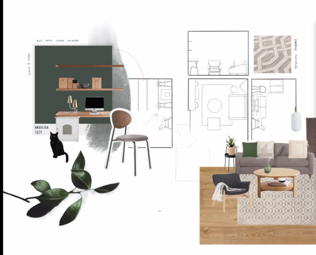
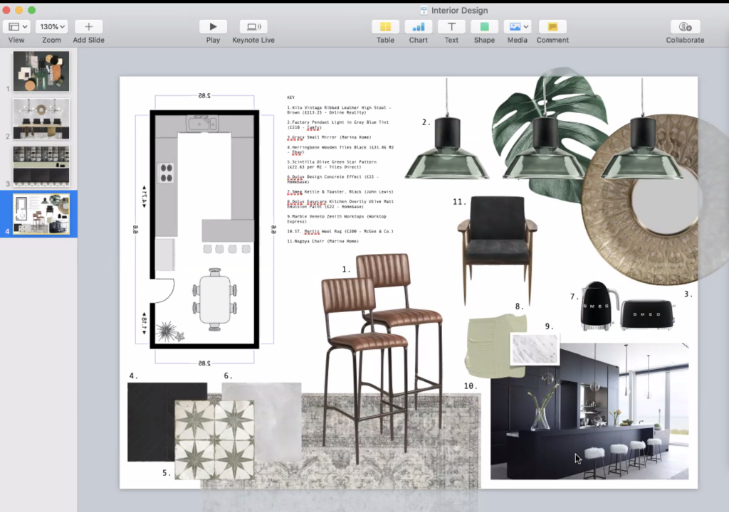
- Use a measured plan of your room on the board to see how everything fits together.
- Collect samples or/and images for your chosen scheme.
- When using glue, apply evenly to avoid pealing. Use glue suitable for the sample. A good all-rounder is PVA glue.
- Adequate size of visuals and samples for the boars (not too many white spaces but also leave enough of negative space to avoid the board looking messy and unclear).
- Use coloured visuals (drawings, collages, floor sections) to showcase the look of your room.
- The samples need to make sense (adjacency) on the board. A sample of flooring should always go at the bottom, cushion fabric sample next to a sofa fabric sample etc.
- Add Key/List of all the items on the board. Or for a more informal look write the info next to the sample.
- The size of samples needs to correspond to the size of the area covering the room. For example, if all 4 walls are covered in wallpaper you can cover the whole board in the wallpaper and use it as a starting point for the presentation board.
- Don’t tilt the visuals and samples, stick them squarely on the mounting board.
- Use different colour paper to frame the visuals, it adds interest and looks very smart.
Would you like to learn more about interior design? Have a look for the next available course.
And check this Pinterest board for even more examples of the work from people coming to the Interior Design classes. Those people have never done anything similar to this and have successful careers in other fields.
Book a free 15min appointment to see if we can work together
