Creating a beautiful and welcoming retail store is no easy feat. It takes careful planning and precise execution to create an atmosphere that shoppers want to spend time in—and more importantly, spend money in. But how do you make sure your store is designed in such a way that it boosts sales? In this article, we’ll explore some of the best retail design tips to help boost your sales instantly. So read on, and get ready to see just how easy it is to bring out the best of your store!
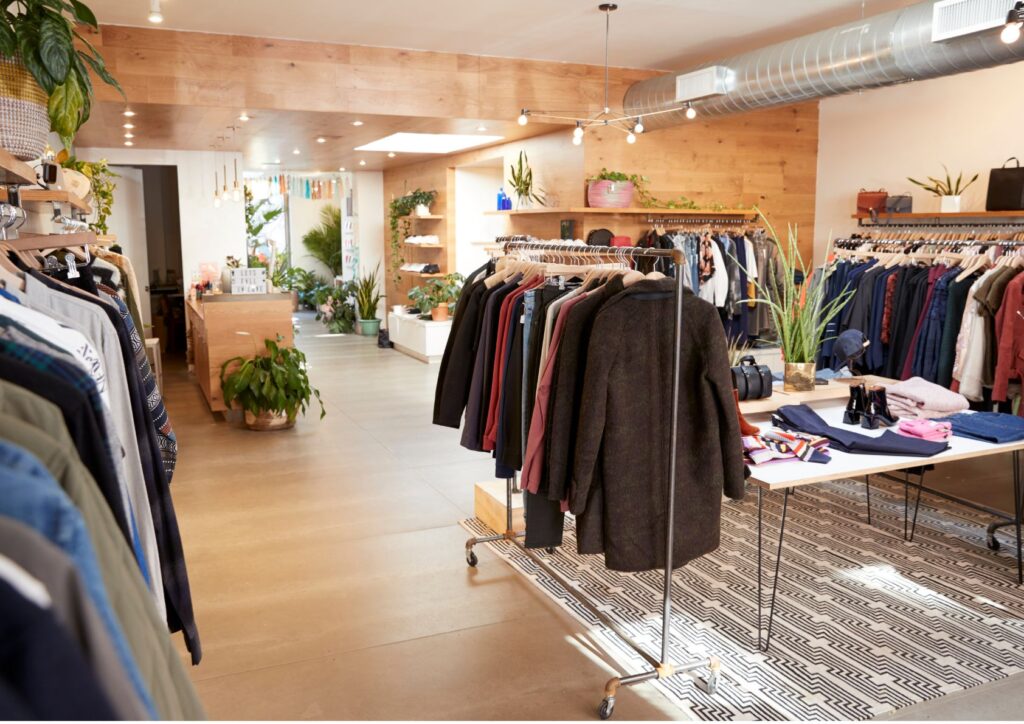
The psychology of retail design
When it comes to retail design, the psychology of your customer should be at the forefront of your mind. After all, if your store doesn’t appeal to customers on a psychological level, you’re not going to make any sales. For example, certain colours have been proven to trigger certain emotions in people. The colour red is known to stimulate the appetite and create a sense of urgency. This makes it an ideal colour for use in grocery stores. Blue, on the other hand, is known to be calming and relaxing, making it a good choice for spas and salons.
Avoid merchandise at the entrance of the store
As a general rule, shoppers are less likely to make purchases when they are first confronted with products at the entrance of the store also known as “decompression zone”. For this reason, it is generally advisable to avoid placing any sort of merchandise right at the entrance of the store. Instead, try to lead shoppers further into the store so that they have a chance to see all of the different products and services that you have to offer before they make a purchase.
Layout your store according to traffic flow
When it comes to retail design, one of the most important things to keep in mind is traffic flow. You want your customers to be able to move around easily and intuitively, without feeling like they’re being herded into certain areas or forced to backtrack. There are a few key things to keep in mind when layout out your store:
1. The entryway is crucial. This is the first impression your customers will have of your store, so you want to make it inviting and easy to navigate.
2. Checkouts should be clearly visible. You want customers to feel welcomed and know where they can get assistance if needed.
3. If you have a large store, consider creating multiple “zones” with different types of products. This can help guide customers throughout the store and prevent them from getting overwhelmed by too many choices.

Provide customers with an immersive experience
In order to provide customers with an immersive experience, retailers need to create a space that is both visually and functionally appealing to encourage more sales and repeat business. The layout of the store should be designed in a way that allows for easy navigation and movement throughout the space. Think about your brand and how you would like your customers to see you. The store environment should be inviting and comfortable, with music and other sensory elements that contribute to a positive shopping experience. The smell, the sound, the light and the sense of touch are all equally important!
Don’t overstuff the shop floor
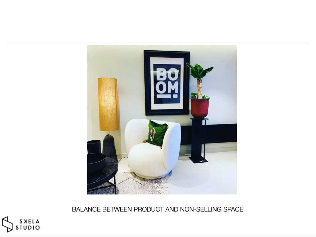
Retailers often make the mistake of overstuffing their shop floors with merchandise in an attempt to boost sales. However, this can have the opposite effect, as customers can feel overwhelmed and turned off by too much clutter. Instead, focus on creating a clean and organised space that is easy to navigate. In this way, customers will take the time to browse your products and make a purchase.
Long aisles should have breaks
In any retail setting, long aisles can be a deterrent to sales. Customers can feel like they are on a conveyor belt, moving too fast to take the time to browse or make a purchase. Adding breaks or “speed bumps” in long aisles can help to alleviate this feeling and encourage customers to slow down and engage with the products on display, leading to increased sales. One option can be to use physical obstacles such as shelves, racks, or product displays placed at intervals along the aisle. Another option is to use visual cues such as colour changes or patterns on the floor that indicate where customers should stop.
It can be difficult to start a retail business, you need to talk to suppliers, employ staff, tons of admin, and then shop fitting on top…
We would love to help you make the best of your retail interior. Make a free appointment to see if we could work together.
From the best layout for those awkward spaces, lighting design or maybe just some product display advice.
