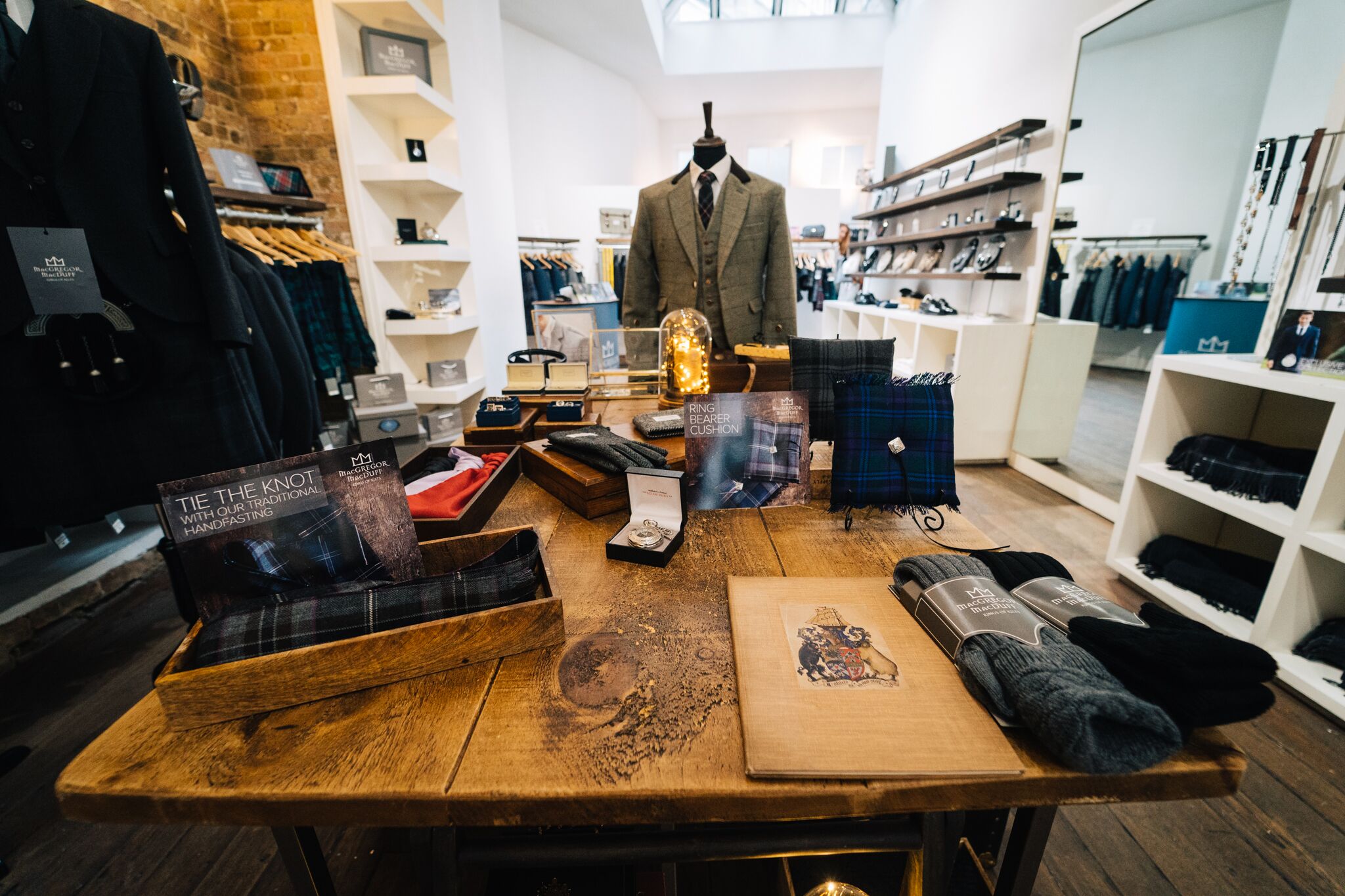
When it comes to making a change to the retail store it can be difficult to get it right. Times have moved on greatly and there is a different focus when it comes to the store. Customers want an experience when they come in. It has to be different from passive buying online otherwise they would simply do that. Here is how we met the challenge for the MacGregor and MacDuff’s flagship store.
The Brief
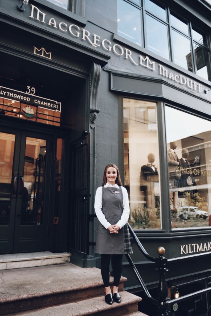
When it came to transforming, the brief we got was to provide a complete fit-out of the shop over the three floors. We worked together with the client to make sure we modernise the brand whilst keeping some traditional elements and incorporating some Scottish heritage as well. It was important to the design to make it an inviting experience for the customer. It needed to be open and friendly. Modern shops need to minimise the clutter and improve customer flow and this was something that shines through in the design we ended up with.
Traditional Touches
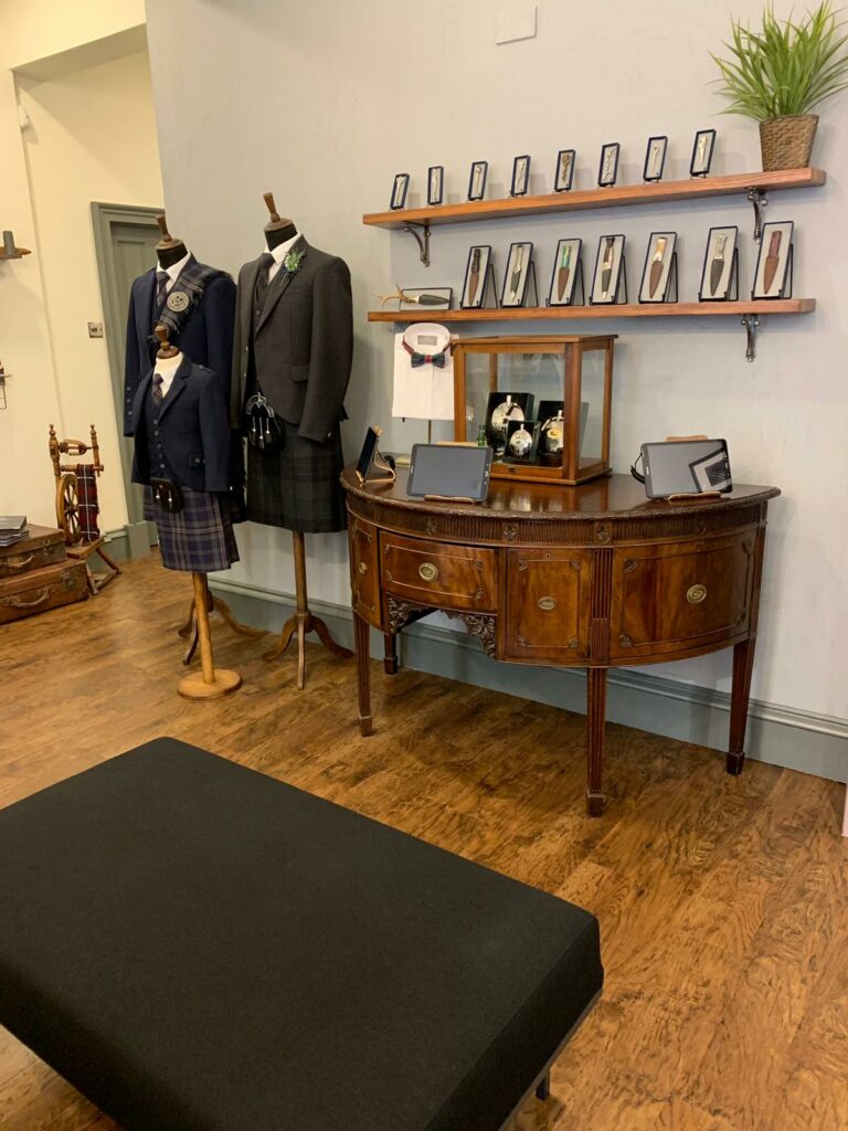
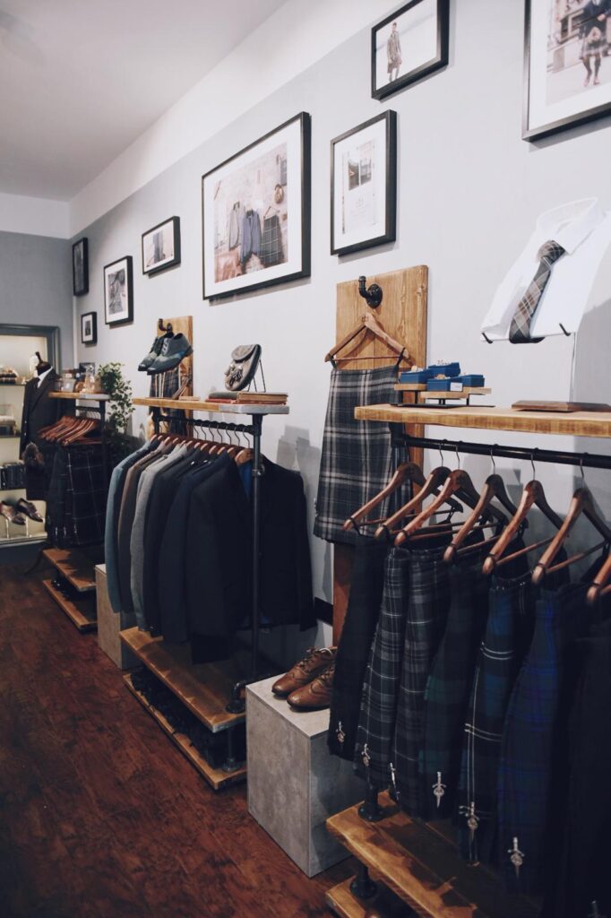
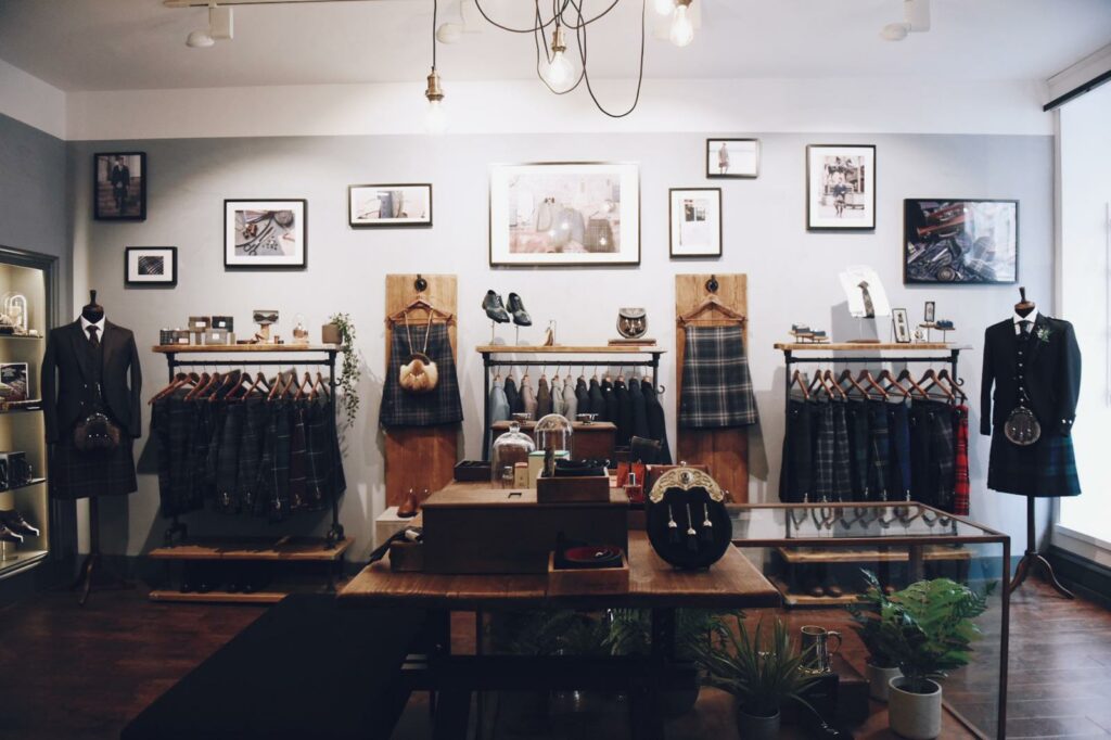
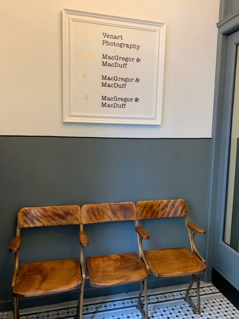
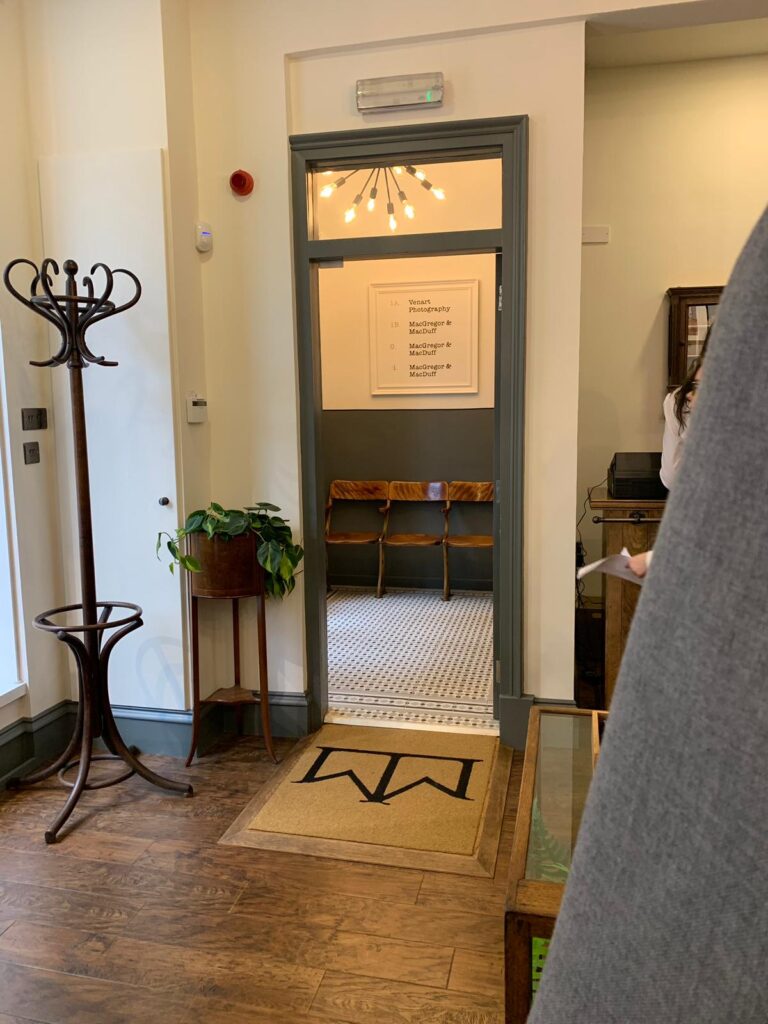
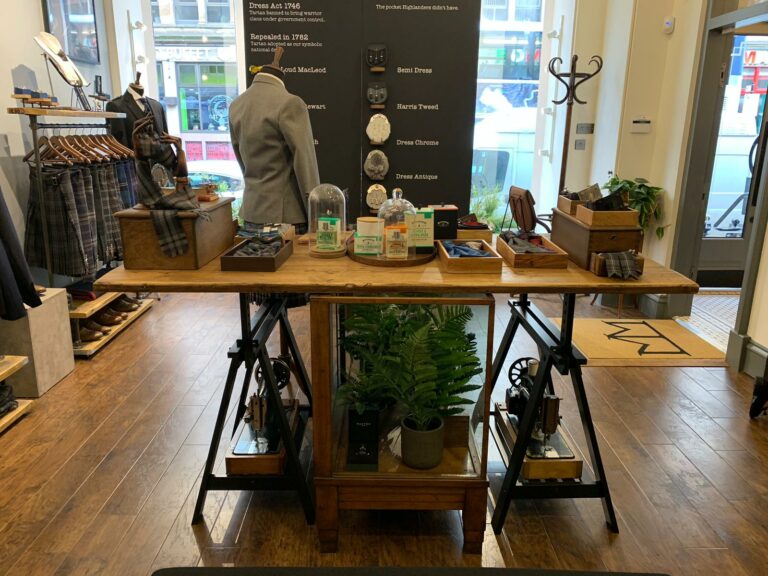
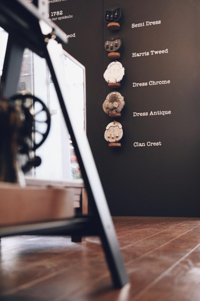
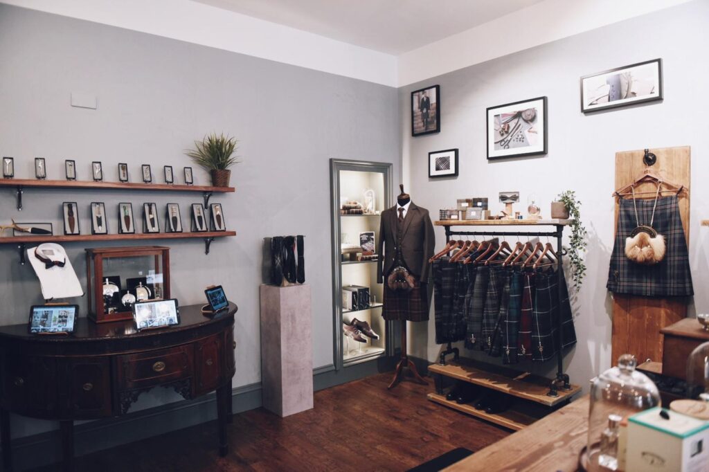
When it came to incorporating the traditional elements, we took things like glass display counters and bare wood, along with upcycled pipework and antiques to create a bespoke look for the shop. The glass displays help to enhance the openness and uncluttered feel of the store and they also allow light to flow around easily. The use of wood creates a traditional and warm feeling to the store that invites customers in, particularly when the harsh Scottish winters are out there.
Soft Lighting
We incorporated a lot of lighting with a distinctly antique feel to it. This gives the place a more inviting tone. The warmness of antique-styled bulbs adds to the traditional feel. This works well with the extensive use of glass as it means that every part of the store is well-lit without having to go for brighter lights. This creates in the mind of the customer again a feeling of open and welcoming space.
Window Treatments
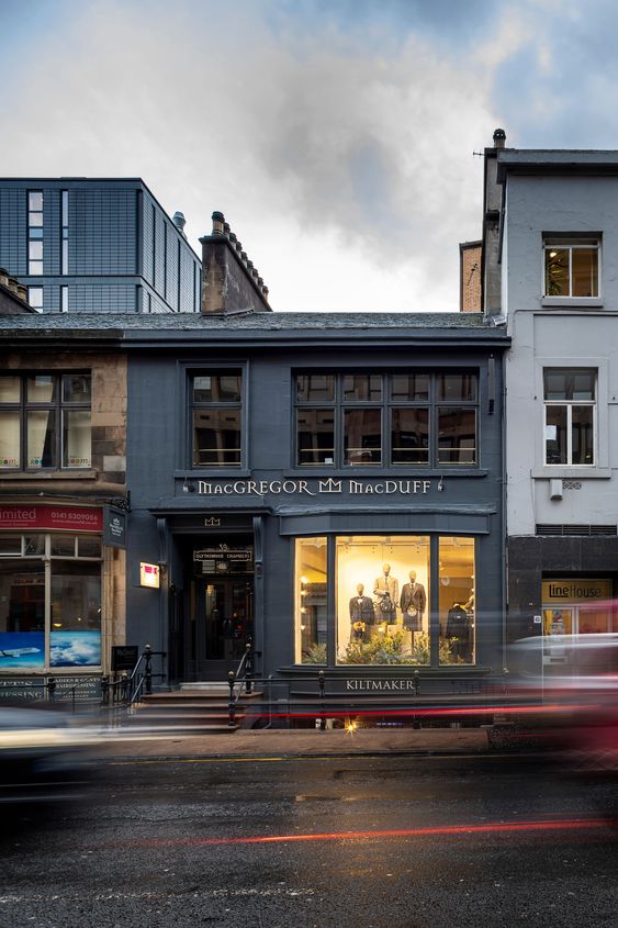
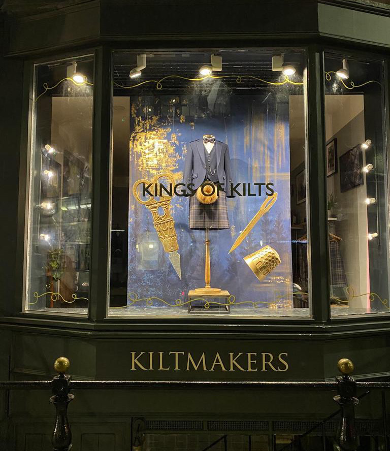
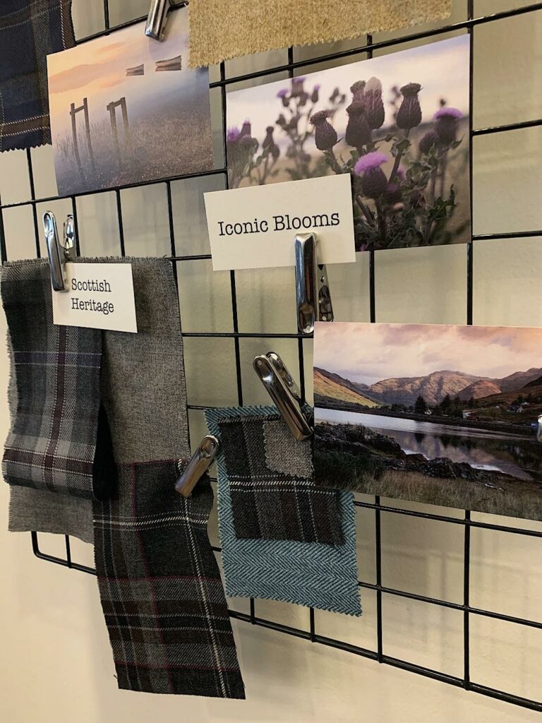
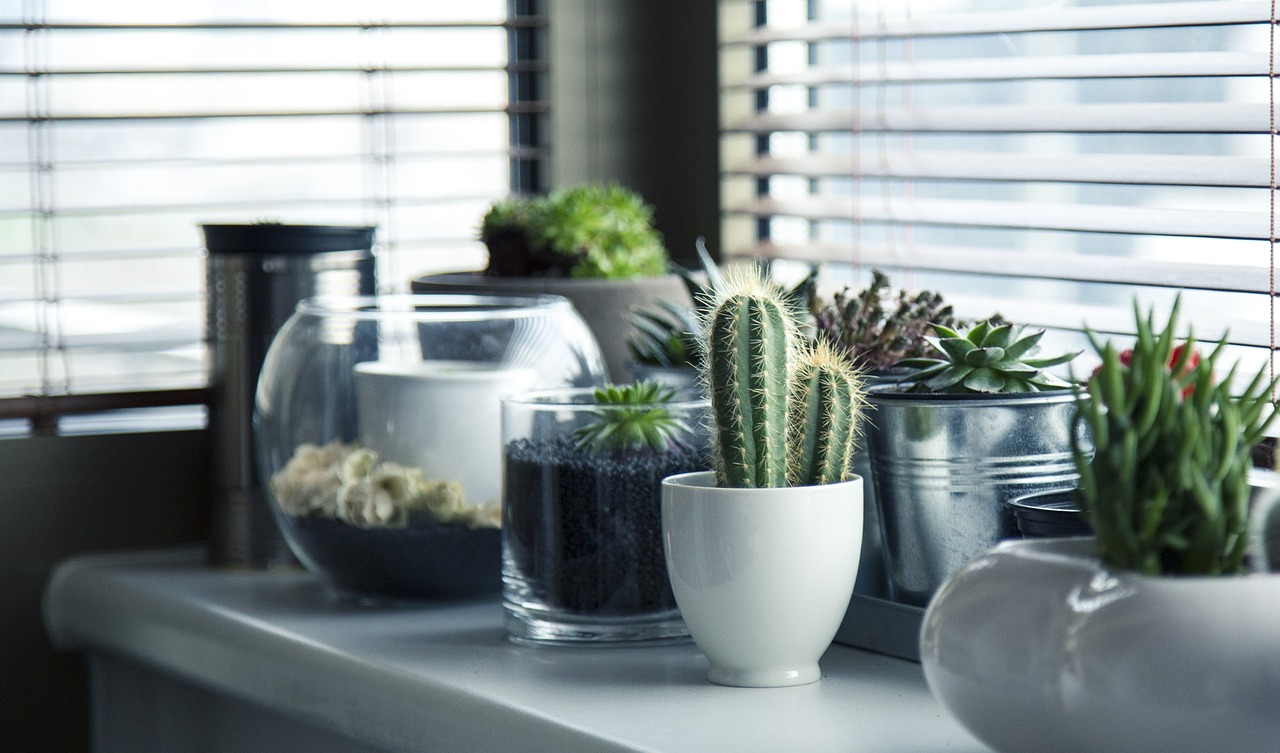
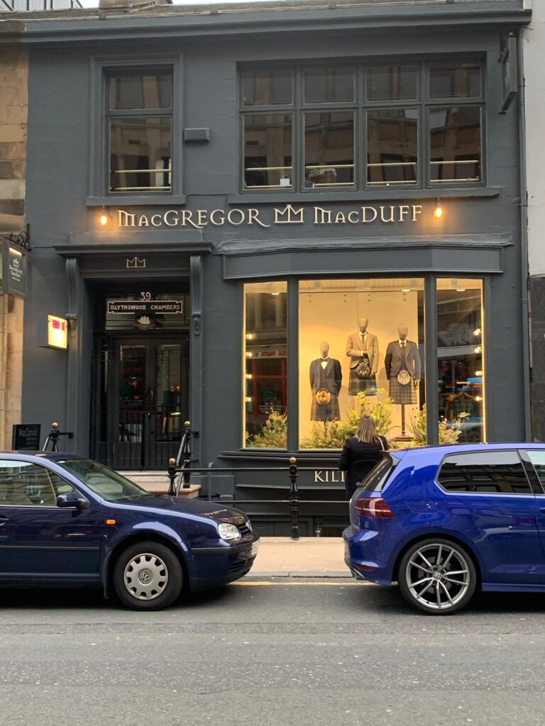
The window display in the store tells the story behind the company with the use of photographs and products displayed simply. This is accompanied by a floral display that accents the colours used in the traditional tartans on display, whilst highlighting the origins of the tartans. The overall effect gives customers a real feel for what the store is about, whilst also being practical enough that it can be changed and refreshed quite easily. This use of design is great for showing customers that the store is up to date, whilst still highlighting the traditions behind it.
Minimalism
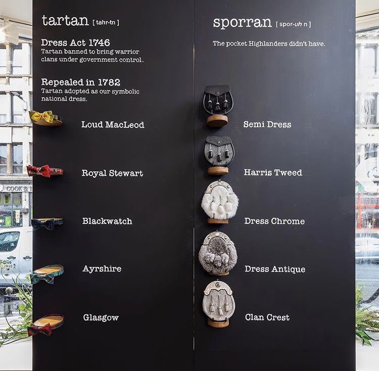
Inside the products are displayed using a simple rack and wall-mounted displays. This helps to keep the floor open and free-flowing. Using such uncluttered methods of display helps with the overall design and is a modern take on the retail experience. We included iPads as a part of the design to help customers discover more but in keeping with the brand style we incorporated them with the antique furniture. Customers want to be able to move around and feel like they are in a space that is more than just a shop. The design elements incorporated into this shop help to do that. It is inviting to customers as well as modern and practical and will help the business to grow into the future.
Do you like what you see? Feel free to book a chat with us and see if we could work together.
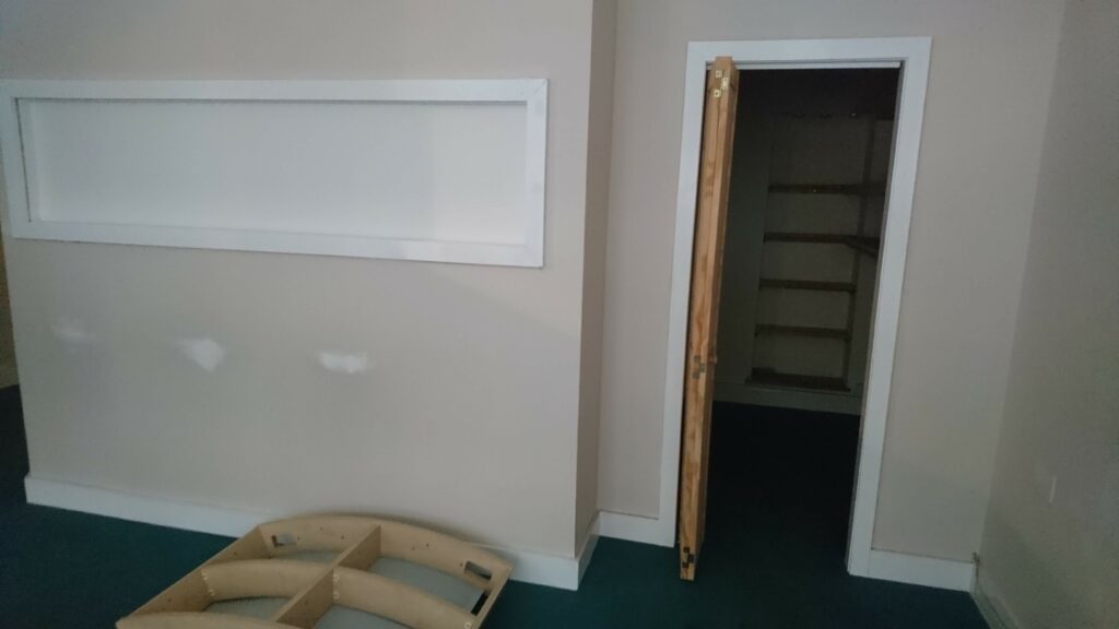
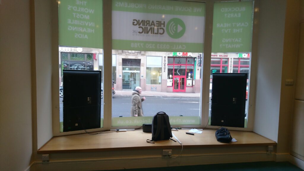
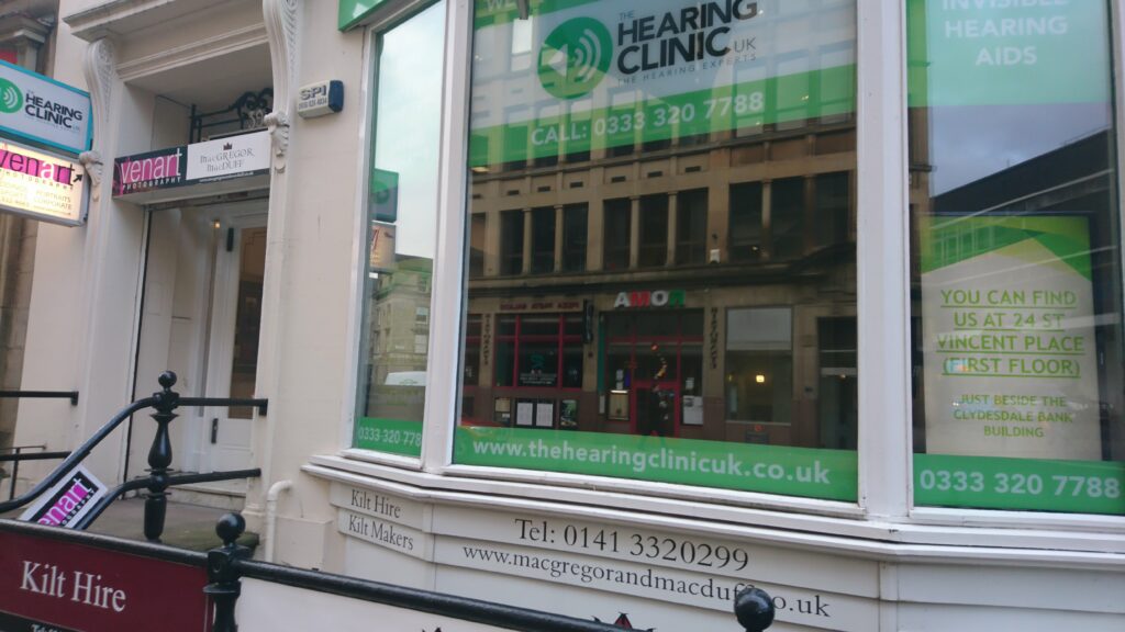
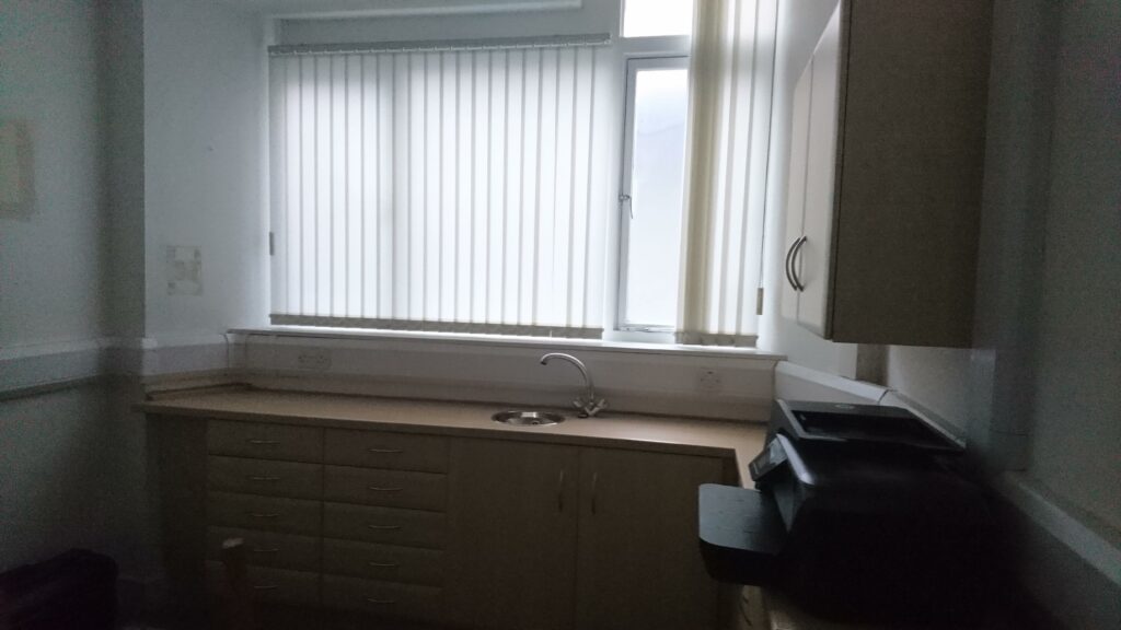
Images of the store before
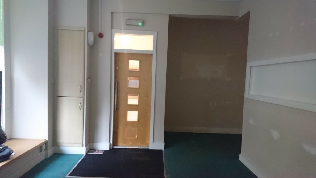
Images of the store after
