For your customers, a visit to your cafe is about more than just good food drink. If you think about the times you have eaten out, your experience can be tainted by a grotty venue with ageing decor and uncomfortable seating. The glaring strip lights hurt your head, and there is the faint sound of the mediocre music in the background. The image you present which starts with your cafe interior design can make a huge difference from being the venue of choice in your area to the one that sees a few customers when the weather is really bad, and people are desperate to escape the rain. Here are a few interior design tips that are universally successful, no matter where your cafe is.
Light Up the Venue
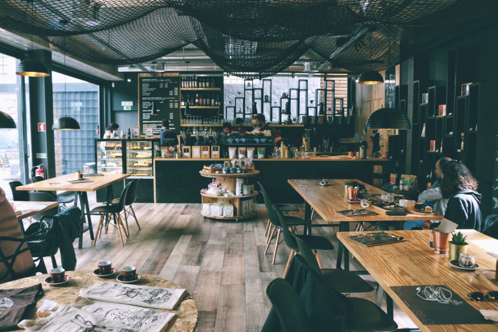
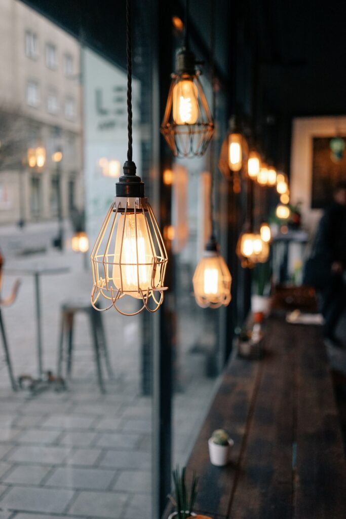
Lighting is a fine line between bright and welcoming drawing customers into space, and atmospheric creating a place where people want to stop and linger. Rather than ugly fluorescent strip lighting, a combination of accent lighting, ambient lighting and decorative lighting should be used. Of course, you have natural light coming in, but the rest needs to be orchestrated through the intelligent use of lighting that fits with the overall theme of your venue.
Colour Me Pretty
Speaking of the theme, you need to have a clear idea of the image you want to present. Avoid cheesy themes, instead, pick tones and images that represent the look and feel you want to create.
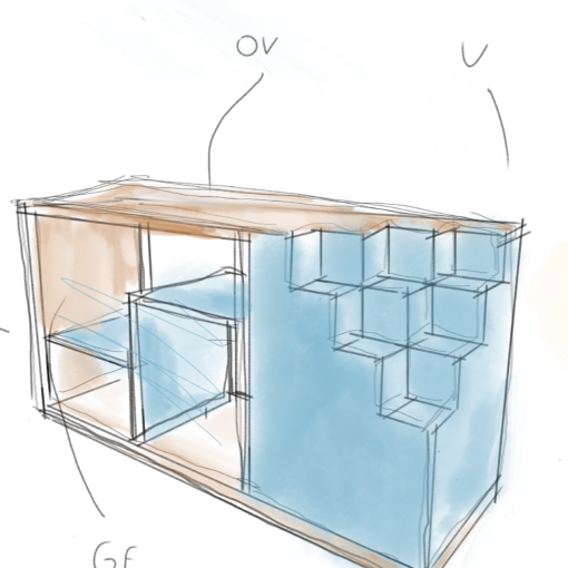
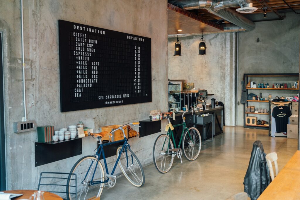
The main function of a cafe tends to fall into one of four categories, the hangout, where people want to come and spend time. In this case, the focus is on seating arrangements catering for the more intimate couple to a larger group. These tend to have a bright colour scheme that is underpinned with grounding darker tones. This is a nice example of a cafe incorporating a bookshop, a trend which is definitely here to stay together with lifestyle stores. We are very fond of designing multi-purpose commercial spaces. An example is this one based in St. Andrews, we worked with the owners to create a cafe and interiors shop that will work in synergy.
A grab it and go cafe, which many of the larger chains aspire to, tends to be more clean and neutral, customers are there to get their order and get out. The counter is prominent, and seating is only really provided for the minority who want to linger. Maybe you want to aim for the old-style cafe; the time stands still here approach. Homely and warm these venues are the sort with a mix of sofas and tables, neutral and light colours, encouraging visitors to stay and relax.
Finally, the corporate venue needs to be more sombre and offer privacy between tables with a darker colour finish.
Spark Appetite With Design
Colour psychology determined that people are more likely to want to eat when surrounded by colours of rich browns, and golden hues, so it is no coincidence that many eateries use this to their advantage. This is often combined with images of food mirrored throughout the decor. With subtle cues like cupcake shaped pendant lights or coffee beans in the wallpaper. Finish this with a flow that connects the seating to the counter, making it easy for visitors to order more, without having to fall over other tables or squeeze down narrow walkways.

